Be Awesome: A Display Font That Lifts Your Digital Brand
Two weeks ago, I was finalizing the hero section of a new coaching website — clean layout, soft background image, intentional whitespace. The headline needed warmth and presence, not cold neutrality. I opened my font library and typed “Be Awesome” into the preview field. Instantly, the tone shifted.
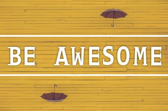
Be Awesome isn’t subtle. It’s a hand-crafted display font with gentle curves, open letterforms, and just enough personality to feel human — but never distracting. Think of it as the friendly voice that says “you belong here” before the first sentence loads. Its lowercase ‘a’ has a soft loop, the ‘e’ tilts ever so slightly, and the uppercase letters carry quiet confidence without shouting. It’s warm, modern, and unmistakably crafted — not algorithmically generated.
I dropped Be Awesome into the main headline: “Clarity Starts With One Honest Conversation.” At 48px on desktop, it anchored the layout beautifully. On mobile? I scaled it to 36px with tighter tracking — still legible, still expressive. No blurring, no rendering hiccups. It loaded fast as a system font because the webfont version is well-optimized (WOFF2 included) and lightweight — under 40KB for the regular weight. That matters when every millisecond affects perception of trust and polish.
Here’s what I learned using Be Awesome across real interface zones:
- Hero sections: Perfect for primary headlines where emotional resonance matters more than dense information. Avoid long paragraphs — it shines in 3–7 word statements.
- Landing page CTAs: Works best on larger buttons (“Start Your Journey”, “Get the Guide”) — never on tiny secondary links or form fields. Its charm fades at under 20px.
- Section headings: Use it sparingly — maybe just the first H2 on a page — then step down to a neutral sans serif for subheads. Consistency doesn’t mean repetition; it means rhythm.
- Digital brand kits: It pairs naturally with fonts like Inter, Poppins, or even Lora for editorial contrast. I paired it with Inter (regular & medium) for body text — clean, accessible, and effortlessly balanced.
- Image overlays: Tested over muted gradients and soft-focus photos. With a subtle 10% black overlay behind the text, Be Awesome stayed crisp and readable — no need for heavy stroke or shadow tricks.
Readability isn’t just about size. It’s about context. On light backgrounds, Be Awesome breathes. On dark ones, I adjusted the weight slightly (using the bold variant when available) and added 2px letter-spacing to keep counters open. And yes — I checked every breakpoint. At 320px width, I switched to a single-line headline only. No wrapping. No compromise.
It’s not a workhorse font — and it shouldn’t be. Be Awesome belongs in moments that pause scrolling: the tagline above a course signup, the title card in a portfolio project, the banner announcing a limited-edition digital product launch. I used it for a boutique online store’s seasonal campaign banner (“Summer Stories, Handmade”) — simple, joyful, unmistakably handmade in spirit, even though it lives entirely on screen.
What makes it reliable for real projects? First, licensing. Be Awesome comes with clear commercial rights — no surprises when deploying to client sites or SaaS dashboards. Second, format support: WOFF2, WOFF, and OTF for design tools. Third, thoughtful design details — true italics (not skewed), standard OpenType features, and solid Unicode coverage for English, Western European, and basic punctuation. No missing accents or broken quotation marks mid-sentence.
Font pairing is where Be Awesome becomes truly versatile. As a display font, it thrives alongside typefaces that stay out of its way. For UI-heavy pages — think dashboards or course modules — I paired it with Inter or Manrope: neutral, highly legible, and built for screens. For a blog redesign leaning into creative storytelling, I chose Lora for pull quotes and longer captions — a gentle serif that echoes Be Awesome’s warmth without competing. The contrast creates hierarchy without tension.
One thing I appreciated: Be Awesome doesn’t try to do everything. It doesn’t include 12 weights or condensed variants — and that’s a strength. It’s focused. It knows its role. That focus translates directly into faster design decisions and cleaner code. No font-display: swap jitters. No fallback chaos. Just one well-made display font doing exactly what it promises.
I also tested it in email headers (with web-safe fallbacks), social media graphics (exported as SVG), and even as embedded text in Figma prototypes. In each case, it held its character — never pixelated, never stiff. That consistency across tools and touchpoints is rare in display fonts.
If you’re choosing typography for a digital brand that values authenticity over austerity — a coaching site that feels like a conversation, a creative portfolio that invites curiosity, a course page that balances inspiration with clarity — Be Awesome earns its place. Not as background noise, but as intentional voice. Not as decoration, but as direction.
It won’t fix weak copy. It won’t compensate for poor spacing or low-contrast color choices. But in the right context — with smart sizing, thoughtful pairing, and respect for its natural limits — Be Awesome lifts the whole experience. It makes users feel seen before they read a word.
And honestly? That’s the kind of detail that turns visitors into readers, readers into subscribers, and subscribers into advocates — all starting with a single, well-chosen typeface.